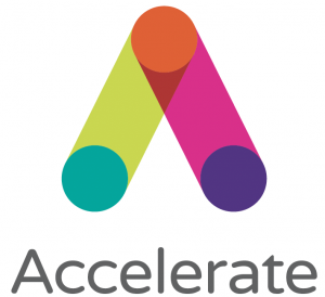
Our logo
Our identity is not just a logo. It's a complete scheme composed of a number of core elements that come together to create a distinctive look and feel that makes
Accelerate instantly recognisable.
Our new logo is based on the letter A. Simply, it’s a monogram for the our name, Accelerate and so much more. It’s constructed to evoke what we do within our sector – joining dots and making connections, but also our evangelical approach to compression and wraps.
Primary logo
We should always try and use this logo on any of our applications. To ensure maximum impact, we always try place the logo is on a white background.
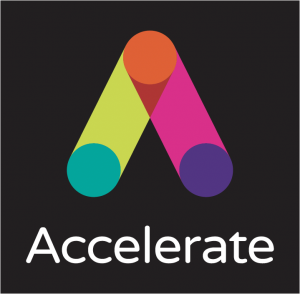
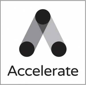
Secondary logos
These should ONLY ever be used when the primary logo can’t or for reasons beyond our control, like event sponsorship.
White text – for use on dark, black or very dark backgrounds
Black and white – to be used when only black and white is allowed. A use case could be a press ad or partnering situations, like Legs Matter.
White / reversed out – to be used when only black and white is allowed. A use case could be a press ad, brand reminder or partnering situations, like Legs Matter.
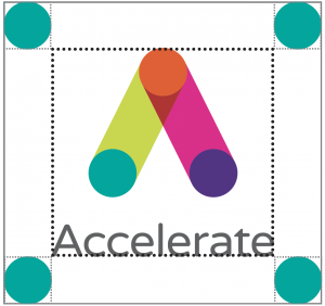
Exclusion zone
In order to protect the logo and make sure it is always legible and clear on all our material, we have developed an exclusion zone around it.
This means that whenever we apply the logo to anything, it should have a clear amount of space surrounding it as shown.
It is calculated by using the height of one circle in the logo.
This means it will proportionally have the same amount of space around it regardless of its size.
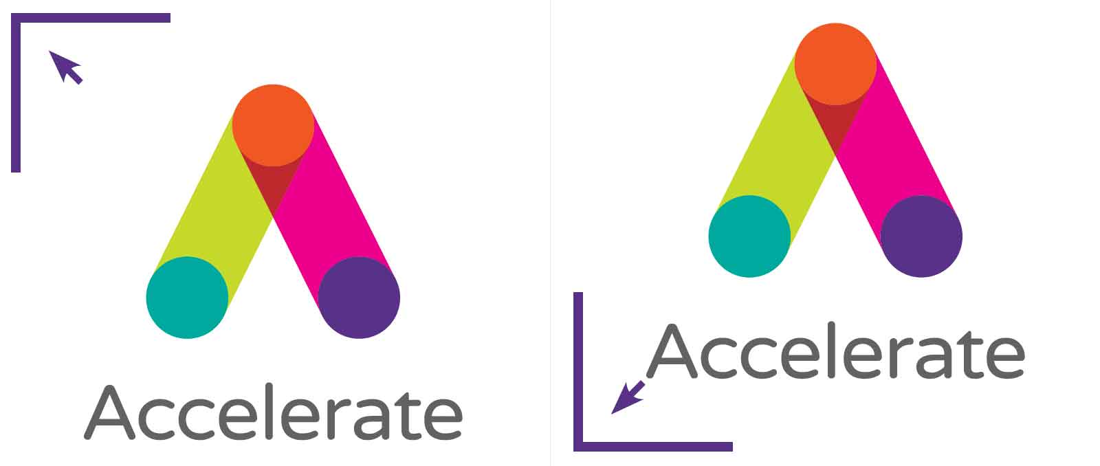
Position and size
Logo positioning
Due to the shape of our logo, it should always be aligned to either the top left or bottom left corner of any application (this excludes brand giveaways and digital use).
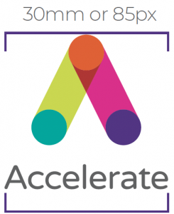
Minimum size
A minimum size of 30mm or 85px wide has been established for all printed and digital material.
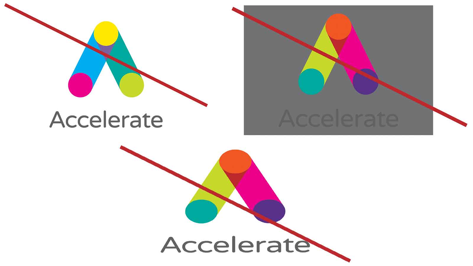
Incorrect use
It’s important that the our logo is correctly and consistently reproduced to help build recognition and understanding.
The logo should not be altered in any way. It must NEVER be re-typed in another typeface, have the relationship between the elements changed, be distorted or appear in any colour other than those specified.