Stationery
We've created these easy to use templates for you to use for any of your communications. Please keep them looking tip top and don't butcher them. We want to keep our brand looking fabulous so we can communicate clearly and help build the recognition we deserve.
Slide decks and PowerPoint
When creating decks for presenting ideas or for training – make them exceptional, not average. We want people who see our slides to feel excited and that we’re experts within our field.
Always think about your end audience and make sure you pitch the tone, content and level right.
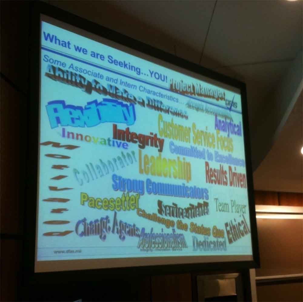
We shouldn’t be creating awful things like this


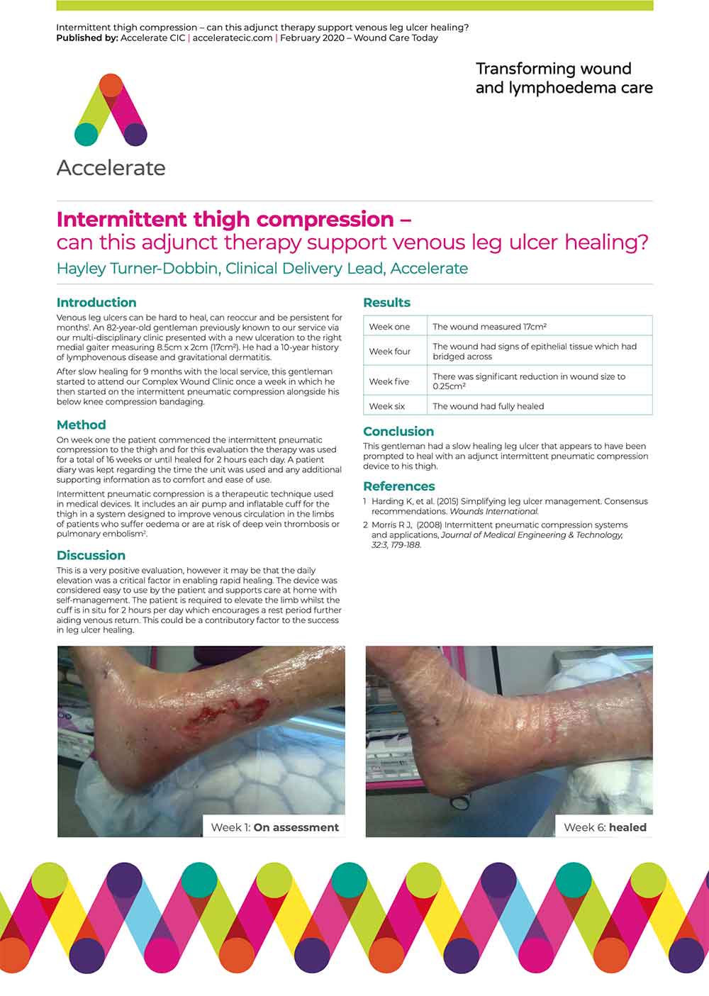
But we should be thinking how we can create and see cool things like this
Tips for creating expert talks and presentations
- Always have a separate title slide
- Make the aims of your talk clear at the outset, think about the role of each of your slides in the presentation
- Always have a concluding slide
- Repeat slides rather than navigating backwards and forwards
- Make a story out of what you have to tell
- Make your slides attractive, use graphics and illustrations to illustrate your ideas
- Use statistics and numbers and make them bold and clear
- Don’t clutter your slides with too much information

Clinical posters presentations
We do some brilliant research, but if we don’t share our findings in an accessible and appropriate way, there is little point to publishing and sharing our knowledge.

Tips for creating standout clinical posters
- Make sure the title and author’s name are prominent and eye-catching
- Tell a story: provide clear flow of information from introduction to conclusion
- Focus on your major findings / points – a common fault is to try to cover too much.Few delegates are going to read everything on your poster, so get to the point
- Use graphs, tables, diagrams and images where appropriate. Use boxes to isolate and emphasise specific points
- Always follow the conference guidelines, which may be specific about what you are expected to present.
- If you add an institution or partner logo, follow their guidelines for its use
- Use all the space at your disposal, but do not cram in the content – white space is an important part of the layout, and good use of it can make a poster elegant and arresting.
- Use colour sparingly – think about why you are using colour; it is especially useful for emphasis and differentiation
- The flow of information should be clear from the layout; if you have to use arrows to indicate the flow, the content could probably be arranged better
- We should use the Harvard (author-date) style when referencing so it’s easy for people to see what we’re talking about at the point we mention it.
Word and stationery templates

All of our templates have been designed so that they’re easy to use. Where possible, the fonts (typefaces) and colours will have be set ready for you. But if you do need to change something, please make sure you keep it within our brand guidelines.
